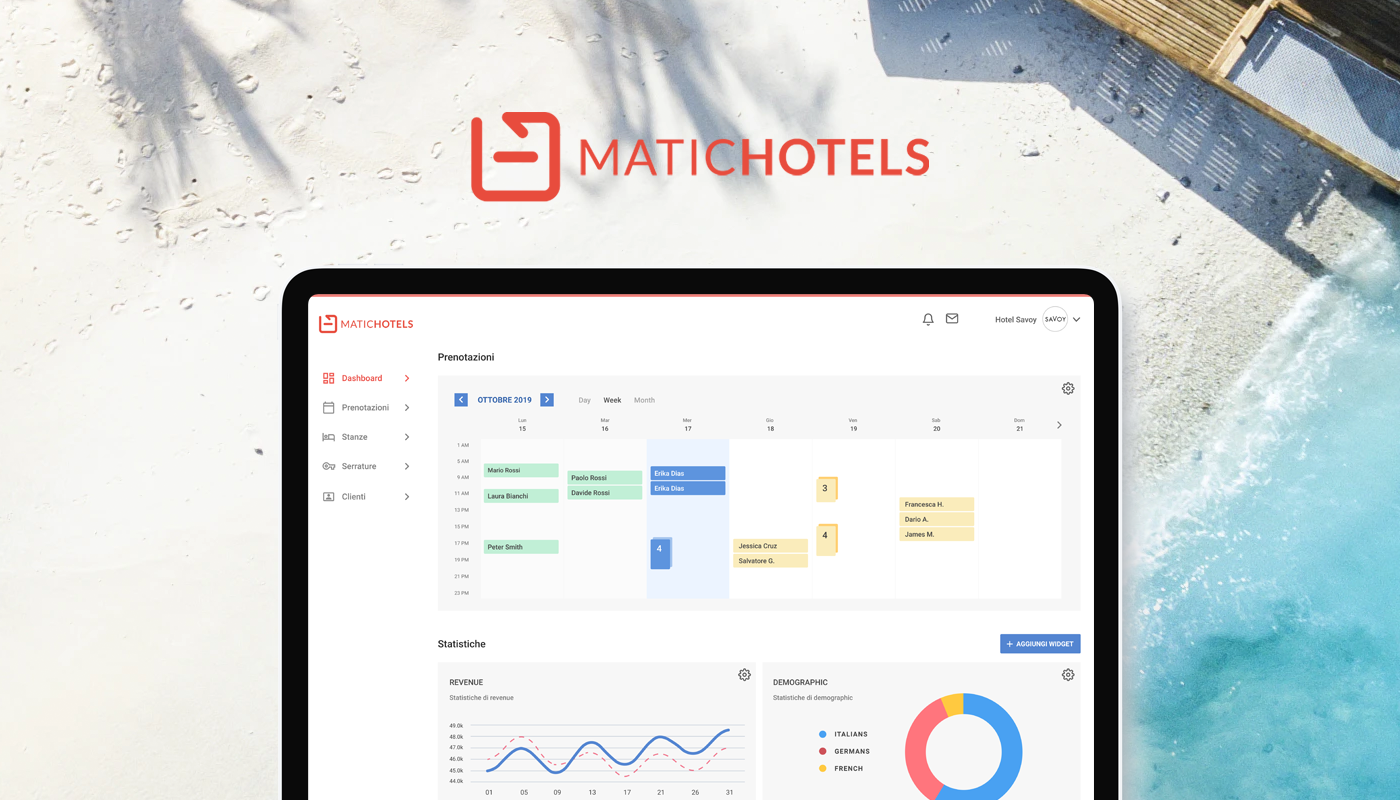
Overview
Matic hotels is an Italian startup that works with hotel industry in digitalising door keys. They were in need of an admin panel, to provide to their clients to manage daily bookings.
Target audience
Hoteliers with diverse demographics and archetypes who need a system that is easy to use.
Team
I worked with 4 stakeholders including 2 co-founders, PM and a developer to create the new interface.
My role
UI Designer
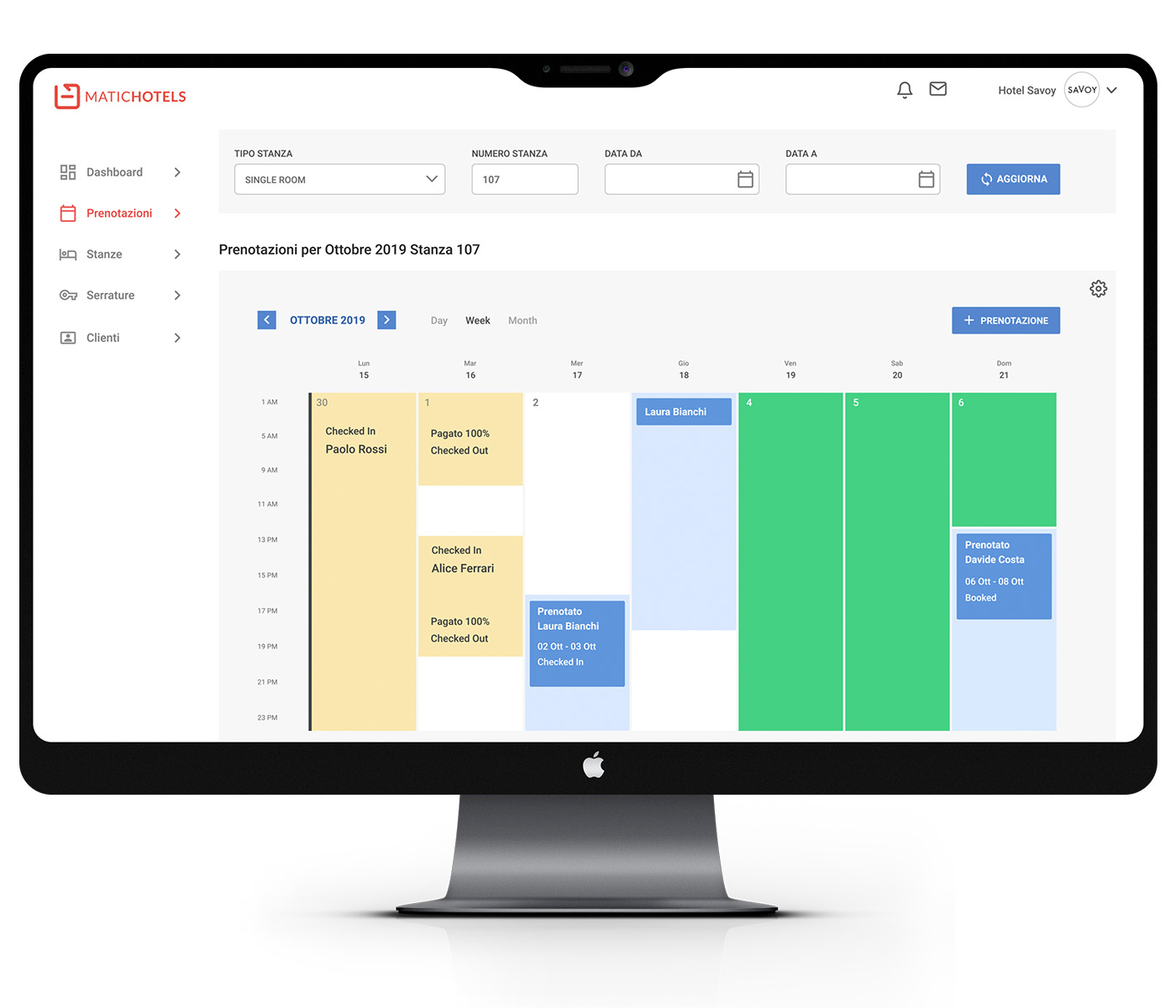
We defined the design and business goals for this project
- We wanted to incorporate new modern visual design trends in this project so that it provides delightful & fresh experience for the users.
- Also, creating a clean interface, minimal and easier to adapt to convey the business goals.
The Process
Testing the brand philosophy
The Matichotels is a fairly young and ambitious brand. The logo is clean, modern and the red colour represents (passion, power, action, desire, and love).
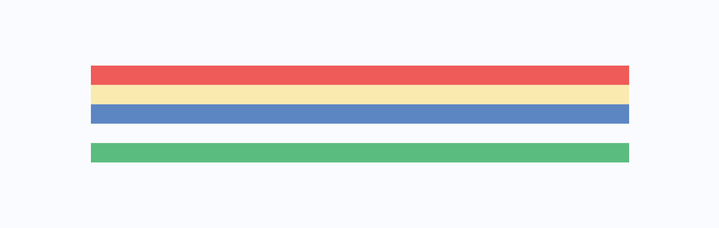
We wanted to have the overall feel of the UI light and subtle but using the red colour to highlight interesting sections.
Furthermore, we tried to use a colour palette to compliment the red and white.
Questions that I asked myself
What will the user think of it and how will they use it?
Forward thinking aspect was very important, we had to make sure to stick with an interface that won’t be too confusing to use and easier for developers to work with in the future.
Am I staying on the track with the business goals?
I’m a firm believer of “design for the people” but sometimes I have to make sure to ask these questions to keep me within constraints that were given.
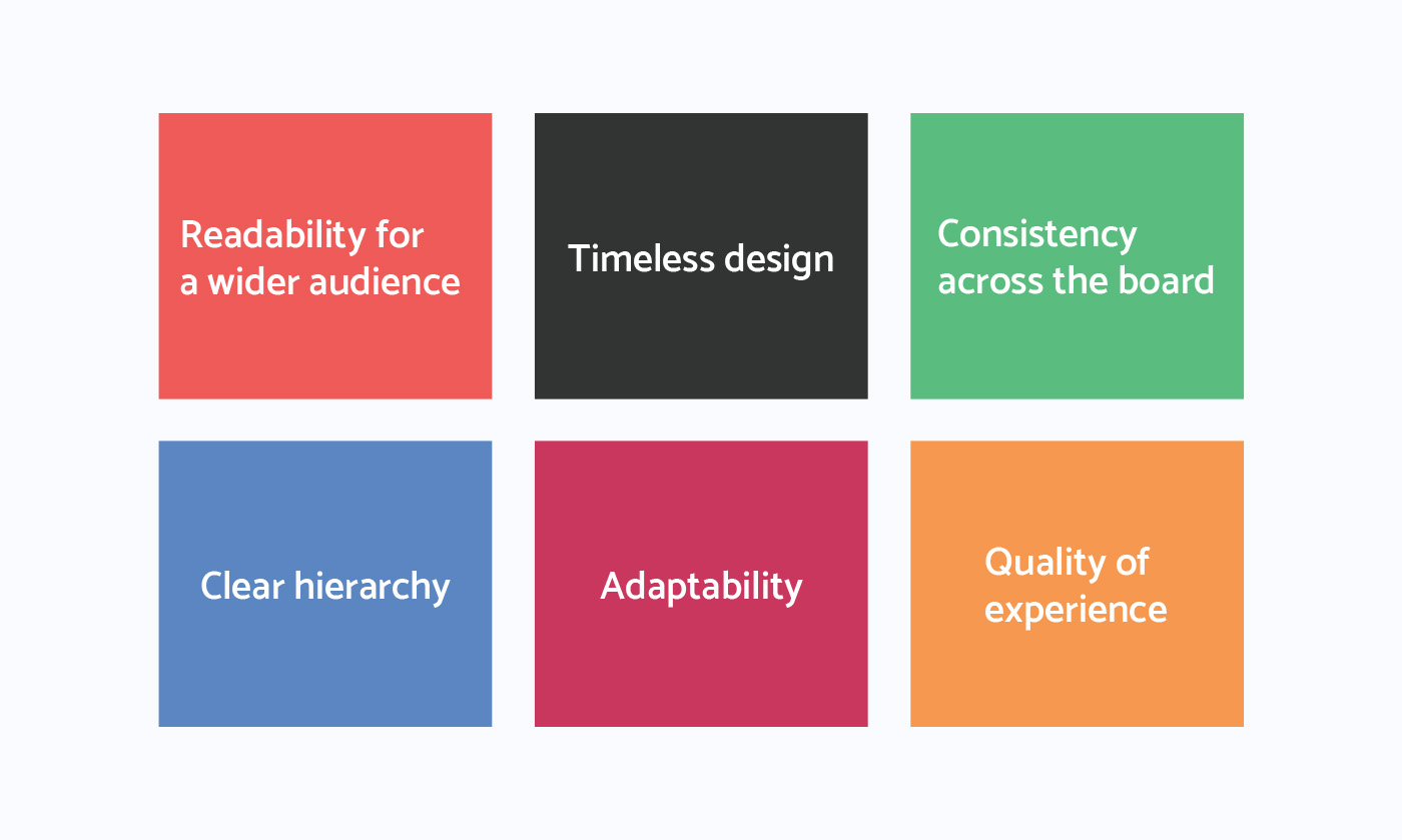
I have broken down the core of our design goals and use this as a point of reference
“People ignore design that ignores people.” -Frank Chimero
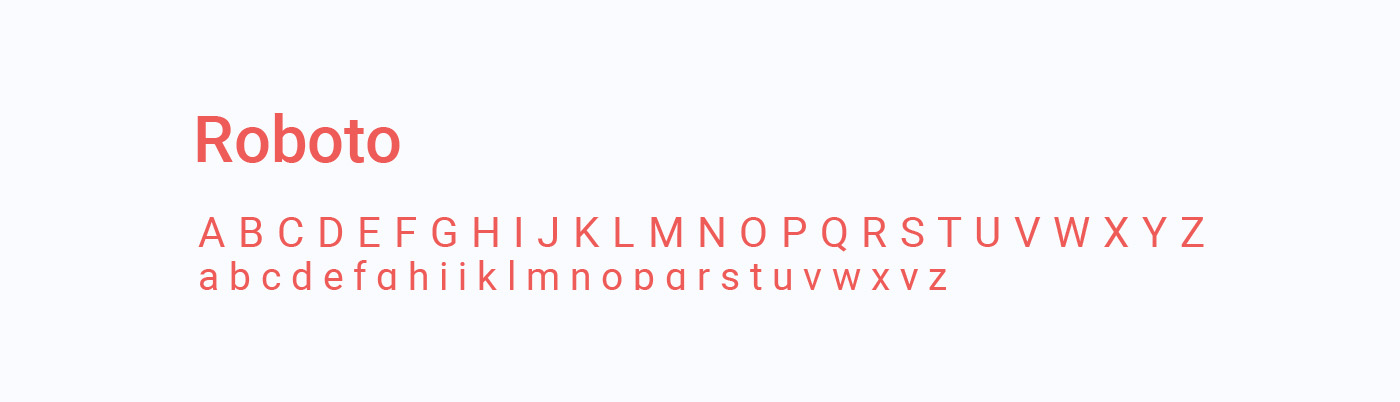
Roboto typeface
We have chosen the “Roboto” as the font of choice. It is a sans-serif created by Christian Robertson that was developed by Google as the system font for Android. Also, comes in 12 different styles makes it a versatile font.
- It has a readable shape, in which the white space takes the lead to create a sharp design.
- The elegant contrast of its strokes makes the body text easy to read.
- Being a comprehensive family font makes it a great choice.
Colour palette
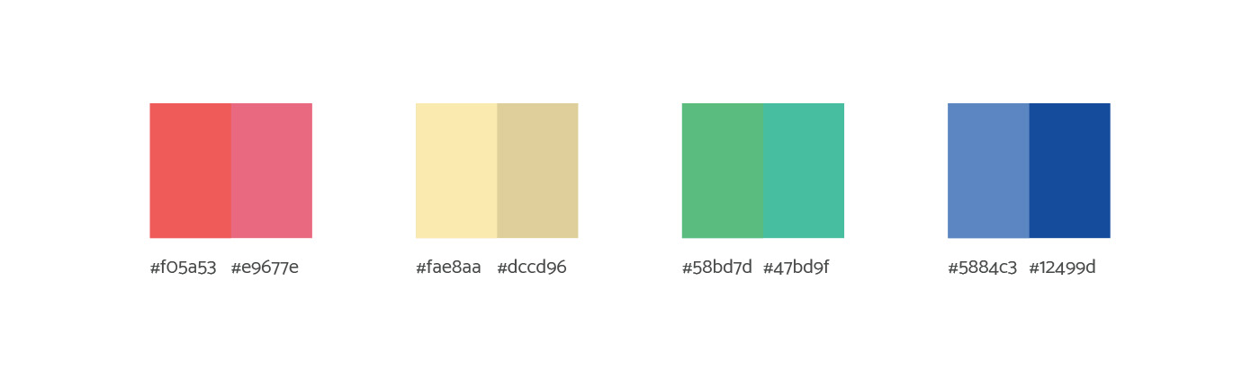
Colour plays a huge role in a system that helps people to see and interpret the design content, learn how to interact with elements, and make correct decisions.
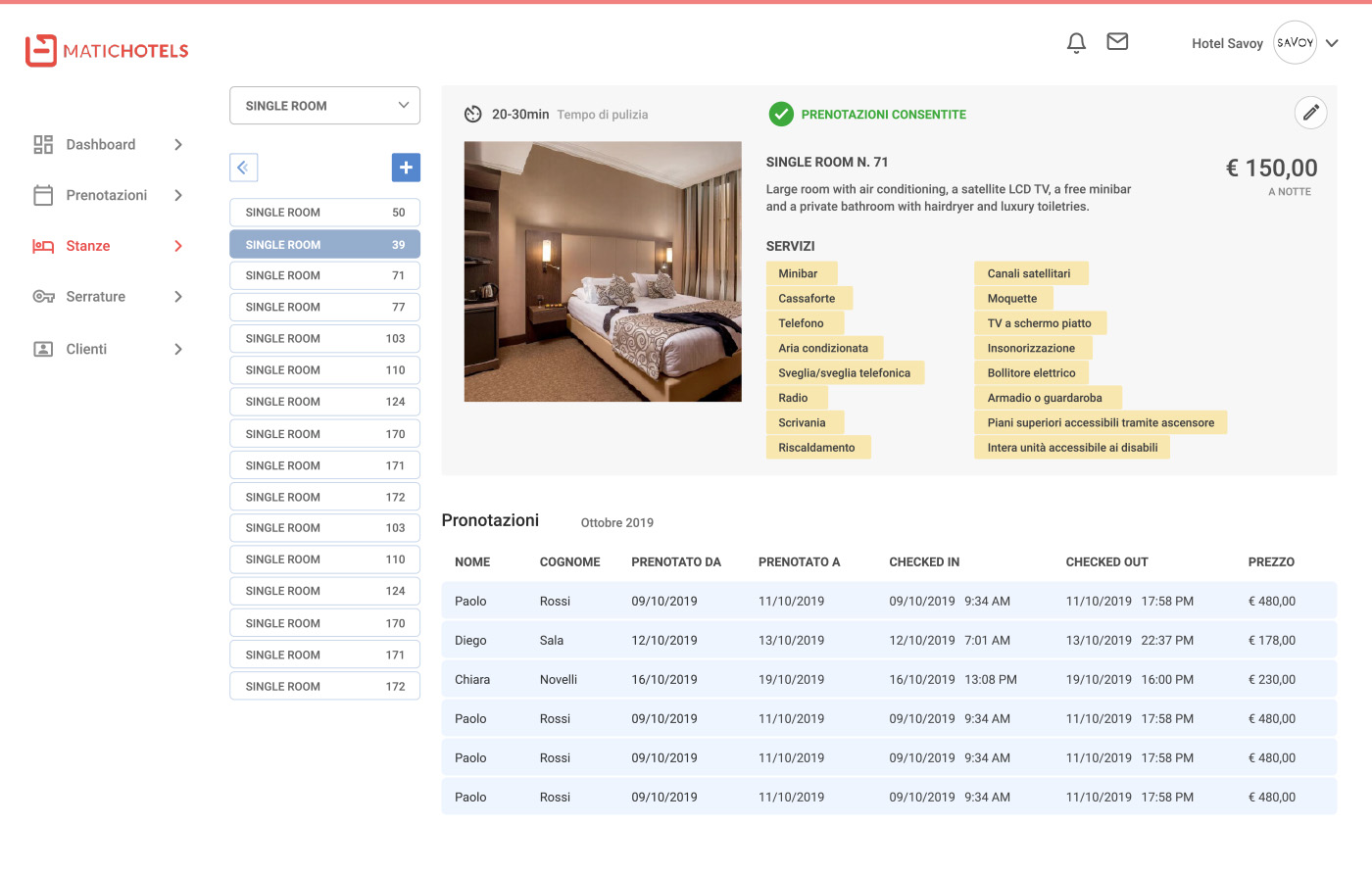
- I used “Blue” as the choice of colour for all the primary call to actions. Blue represents meanings of depth, trust, loyalty, sincerity, wisdom, confidence, stability.
- Extended the palette with some fresh gradients to stay current with trends.
- I also introduced a tone of yellow and green to give more contrast to the overall UI.
Icons
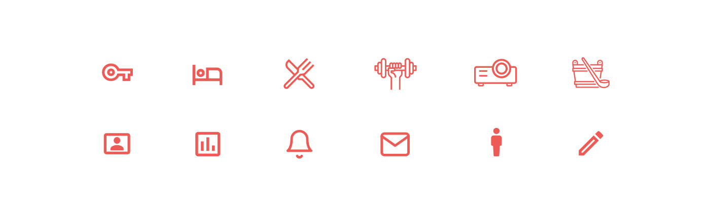
I used flat design inspiration for my icon choice. I came up with icons that are very familiar by the most of the users to stay in the theme of “timeless design”. Also, the icons are very subtle and elegant.
Wireframes
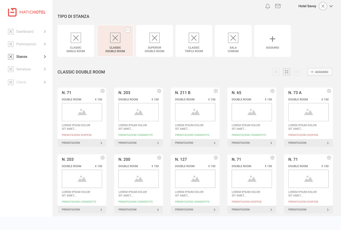
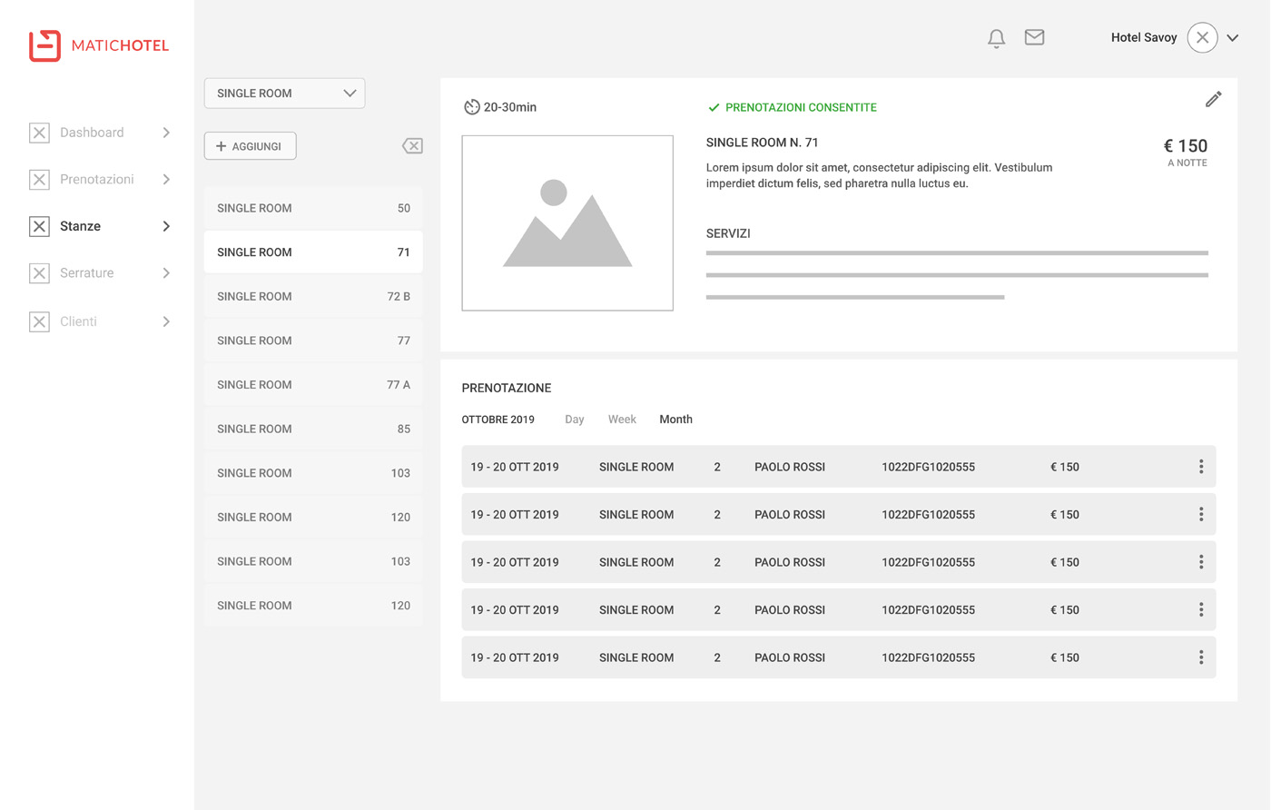
In the design process I initially started to sketch wireframes on paper and moved to the computer.
Once the wireframes were done we examined the design and kept improving the overall image. Then we presented it to the client and got some feedback to work with.
Mood board
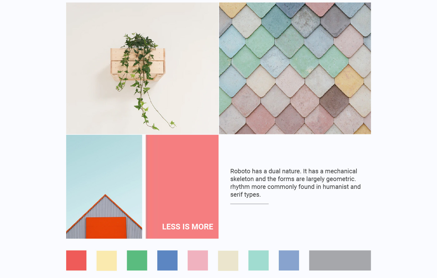
The idea was to portray a clean and subtle look to the interface. I wanted to use white & red colours and support it with other complimentary colours.
Final design
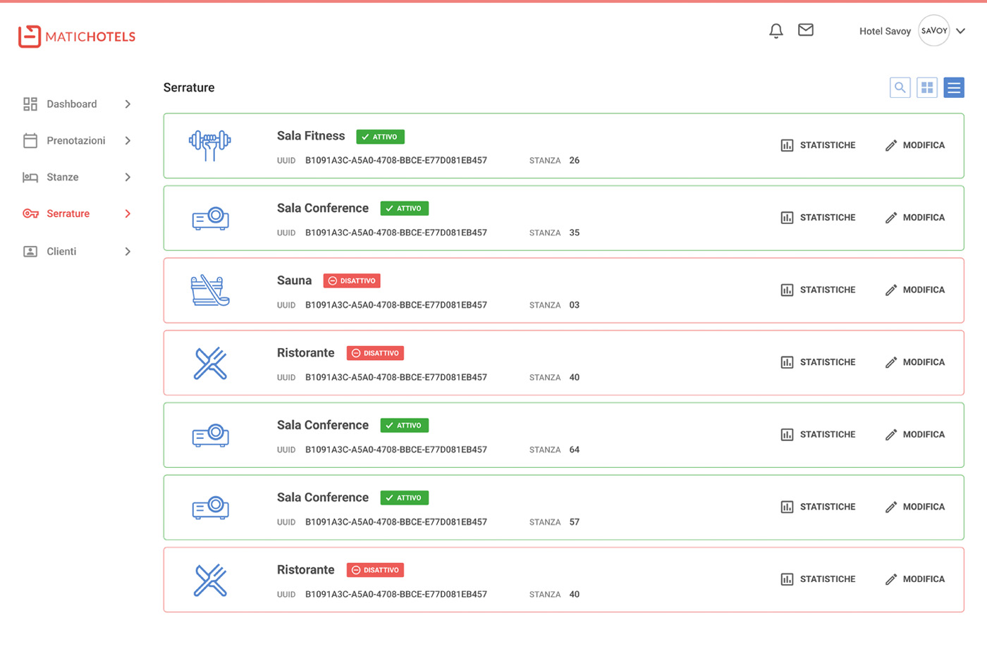
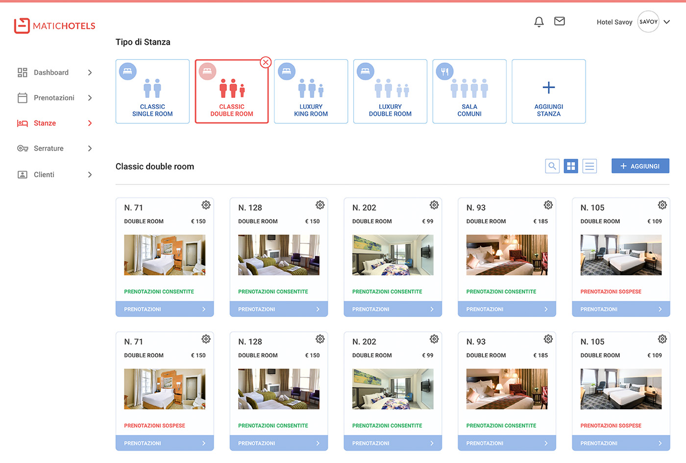
Few screens from the final admin panel.
Conclusion
Did the final UI deliver expectations?
As a result, they wanted us to create their new mobile App.
Overall, we manage to achieve our goals. Also, to be aligned with the business goals of our clients while providing a pleasant UI design.
Final thoughts
Defining the goals of your product from the start and constantly keeping yourself on track with it till the end, will help you make more effective and better design decisions.